Welcome back to #wonkywednesday. Each week I do a deep dive into the election and registration data that makes up the electoral landscape of our home, Onondaga County. I am taking a bit of a diversion this week to delve into the topic dominating our political discussion here, redistricting of the County Legislative districts. Over the last two months there has been a wild and rushed process where the GOP legislators and County Executive have rushed through a process that resulted in the County Executive vetoing their own maps. This has put the county in a bit of chaos as the County Charter has no prescribed way forward. The County GOP legislators now have started another process to decide these maps by December 21, 2021 with legislators drawing their own maps. The Democratic caucus has put forward a plan to take longer and sending the maps back to the reapportionment commission.
The County GOP though seems determined to have a vote on December 21, 2021 and the Democrats and GOP have put forward new maps. To make things more complicated the GOP has submitted two different maps (2.5 &4.0) while the Democratic legislators have submitted their maps (3.0). The GOP maps only differ in how they divide the City of Syracuse and their suburban divisions are the same. You can view the maps here at the Reapportion Commission website: http://www.ongov.net/legislature/ReapportionmentCommission.html.
For today’s #Wonkywednesday I will dive into the differences between the GOP and Democratic maps both visually and with some statistics as well. While at first blush the maps completely different, their differences boil down to 4 main areas of the County. I will look at first how the divide up the City of Syracuse, the Northern Suburbs, Eastern Suburbs, and Western Suburbs, where the differences are most stark. The choices in these four areas of the county show the different philosophies in redistricting for the GOP and Democratic lawmakers.
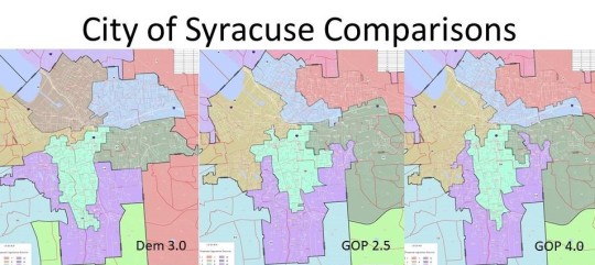
The choices inside the City of Syracuse are where all the differences start. Choices made here have ripple effects throughout the county as a whole. It is also the place where the most improvement could come from the disastrous 2011 map which divided the City of Syracuse into 9 different legislative districts with only 2 totally inside the City and 7 stretching city portions out into the county. This idea of “metro-government” was a novel concept proposed by Onondaga County Reapportionment Committee member Ryan McMahon, now the County Executive. Critics have claimed, including me, this was just another term for Gerrymandering and divided the City needlessly. With a population of over 148k the City of Syracuse could have 5 whole districts inside of it and sixth district would be needed to take some excess population. Both the GOP plan and the Democratic plan try to fix this by having just 6 districts in the city, but that is where the similarities end.
The Democratic plan divides the city into 5 wholly contained districts representing neighborhoods in the East, Northwest, North East, center city and valley portions of the City. A small portion of the west side is paired with Geddes and a small portion of Camillus to create another district. The two GOP have 6 districts but 3 of them span out into neighboring towns leaving only 3 districts inside the City proper. The 6 districts do not really fall into known neighborhoods chewing up traditional neighborhoods like Eastwood, Lincoln hill, university, and the south side into different districts. There are also stark differences in minority representation which I will dive into in the metrics portion of this column.
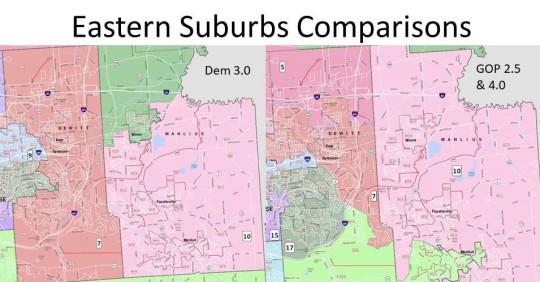
The Eastern suburbs are most affected by the desire to split the city into districts and pair them with more white areas of the county. The Town of Dewitt in particular is drawn and quartered in the GOP plan. Despite having a population of just 26k and could easily fit inside one legislative district, as we see in the Democratic plan, but they needlessly divide it into 4 different districts. In fact the Dewitt portions are either in the minority or near the minority in all four districts making it likely a Dewitt resident may not be represented in the legislature under the GOP plan. With Dewitt being a heavy Democratic town this move is suspect, especially when in the GOP plan the town of Lysander is kept whole, a similarly populated town with high growth rate but just happens to be Republican. They also move the traditional Town of Manlius district north and take the village of Manlius out of this district. The Village of Manlius happens to be Democratic and the newly elected GOP legislator Gregg Olson barely won his election in an ever blue town of Manlius. This could be why they are trying to make OCL 10 more conservative.
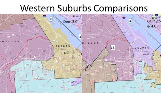
The Western suburbs are similarly affected by the City of Syracuse choices. In the Democratic plan the town of Geddes is kept whole inside one inside one legislative district that adds population from fast growing Camillus and the West side of Syracuse. The GOP plan splits the town into 3 different districts, despite it having only 17K citizens and actually having a negative growth rate over the last ten years. A similar town in Onondaga with 22k which lost population was kept whole in the GOP plan. The Democrats do divide Camillus into three districts where the GOP divides it into two, however the choices within are still suspect. Eastern Camillus is paired with Elbridge the western most towns in the GOP plan through a portion of Van Buren creating a long winding district. The Democrat plan divides eastern Camillus into two different districts pairing with neighboring towns while keeping the western portion of Camillus with Elbridge.
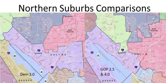
Finally the Northern Suburbs, particularly the Town of Salina is an interesting snapshot of how even when the Democratic and GOP maps agree on number of districts in a Town, their differences show the different choices they make. In the Democratic map the Town of Salina has three different districts, however 28k residents of the town of 33k is in one district, a small Election District bordering Dewitt is put into that district and a small portion of Salina is paired with the new district 5 that takes excess population from Cicero, Salina and Clay as they all require more than one district. In the GOP map a random Ed is paired with a Clay district, half the town is paired with the district 5, and the other half is paired with a winding district that snakes around Onondaga Lake into Geddes putting the residents of Solvay and Liverpool together.

Looking at the 3 new maps and comparing with the old maps all of them do a better job of trying to keep towns from being divided unnecessarily, but again the Democratic plan is best. Each legislative district must be approximately 28k residents. So any town with less than 28k residents the goal should be to put it wholly into legislative district. Manlius, Salina, & Cicero have more than28k residents so they would ideally have two legislative districts inside of them. Clay has 60k residents so it should have 3 districts, and as we discussed Syracuse with 148k residents would have 6. In the GOP map the Towns of Dewitt(4:1), Salina(3:2), Camillus(2:1), Geddes(3:1), Van Buren (2:1) & Onondaga (2:1) have more than the required legislative districts in them. In the Democratic Maps Camillus (3:1), Onondaga (2:1), Lysander (2:1), Van Buren (2:1) & Salina (3:1) have more than required. Van Buren in both maps is divided mainly to keep the village of Baldwinsville whole, which is required by the new state law. In Onondaga in both maps the Onondaga Indian nation is divided and put in the southern district where the Democratic map added in the Nedrow community as a whole. Lysander and Camillus have seen higher than average growth in population along with Clay and Manlius so if that pattern holds having division in those towns are justified. The towns of Geddes and Dewitt have been population neutral over the last ten years if not deficit and dividing them in the way the GOP has done is arbitrary and needless.
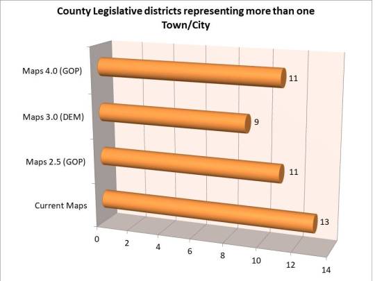
Similarly having a representative cover more than one Town or city should be avoided ideally to allow them to focus on that areas needs and advocate for those citizens. The Democrats by keeping neighborhoods together have done that with only 9 districts spanning Town/City lines while keeping 5 districts wholly inside the City of Syracuse, 2 inside the Town of Clay, and 1 inside the Town of Manlius and Salina. The GOP in their theory of Metro Government has 11 seats spanning lines while keeping 3 districts wholly inside the City of Syracuse, 1 district wholly inside the Towns of Clay, Cicero, and Manlius.
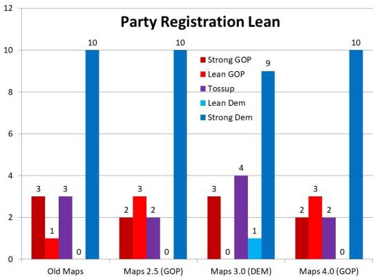
It is hard to determine partisan leans in these districts as turnout in odd year elections ends up playing more of a factor than actual registration. For instance Democrats have had strong partisan leans in 10 districts for the last several cycles yet only consistently win in 6 seats. This is in part due to lower Democratic turnout in odd years as we saw in last week’s #wonkywednesday as well as large swaths of non-affiliated voters who vote differently in local elections than they do in federal elections. Incumbency is also a factor as well. For purposes of illustration though I have ranked the districts in terms of strong and lean rankings for partisan purposes where if a party had more than a 5% enrollment advantage it would have a strong ranking, less than 5% but more than 3% it would have a lean ranking, and lower than 3% it would be a tossup. It’s clear in these rankings that both GOP maps create more leaning GOP districts than the current maps and less tossups. The Dem map creates more tossups, lessens the advantage in one Democratic district and has one less GOP leaning district.

I thought it would be helpful to get a neutral unbiased look at these various proposals. A third party has uploaded the 3 new map proposals as well as the old proposal to the Dave Wasserman Redistricting app. This neutral app compares legislative district lines to the census numbers and past performance. This is a great way to compare the 4 maps in a quantitative way and cut through some of rhetoric being lauded from all sides. The four main areas of comparison are Proportionality, Competitiveness, Minority Representation, and Compactness. With all 4 statistical categories the higher you rank the better and the scores are ranked 1-100.
You can see all four maps on the App at the following links:
2011 Redistricting map: https://davesredistricting.org/maps#viewmap::eab89c8a-5408-4609-9ef6-dc198eac7530
GOP Map 2.5: https://davesredistricting.org/maps#viewmap::7d3ccc35-6aa7-4fe9-8af8-63a30071f5af
DEM Map 3.0: https://davesredistricting.org/maps#viewmap::2db8abb4-66de-47ce-9caa-5fa4553a1a22
GOP Map 4.0: https://davesredistricting.org/maps#viewmap::5362d5f1-5baf-470f-ab74-51e7ebe1aad7

The first ranking of proportionality tries to measure the size of the districts in terms of land mass and how equal they are. This is hard to do on a county-wide level with a dense urban core and sparsely populated rural regions. It is notable though that in this statistic the Democratic map improves on the old district map whereas both GOP maps are rated worse than the oft criticized 2011 maps. Advantage Democrat 3.0.
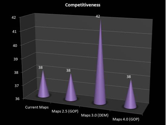
Competitiveness analyzes past performances of the districts in various elections as well as voter registration data to try and determine the likelihood of competitive districts. Once again the newly submitted GOP maps do not improve on the 2011 maps ranking as a tie. As expected from the partisan data I shared earlier the Democrat 2.0 map is rated as more competitive. Advantage Democrat 3.0.
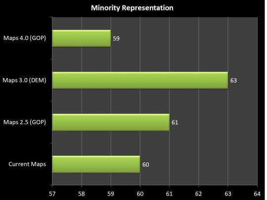
A great deal of the discussion around the vetoed maps is around minority representation. The GOP maps cracks the only Black majority district and splits them into white plurality districts. They’re claim this is to prevent future lawsuits is baseless and flies in the face of redistricting practices in the last few cycles as well as the Voting Rights Act and newly signed State Redistricting guidelines. While their map 2.5 shows a slight improvement on minority representation from the old map, their map 4.0) is actually rated as a step worse. The Democratic map 3.0 ranks higher on this metric as it keeps the majority black district and refrains from unnecessarily pairing city neighborhoods with suburban neighborhoods. Advantage Democrat 3.0.

The final metric may be the most notable, compactness. These metric studies how compact the individual districts are and whether they needlessly have longer obtuse shapes. This is one of the more important attributes to the new state law and could be the crux of legal arguments along with minority representation. It also happens to be the starkest difference between the maps. The 2011 maps were criticized for their obtuse meandering shapes and it is again notable that both submissions of the GOP map were rated worse than the 2011 maps. The Democratic 3.0 map rates much higher on compactness making it more likely to keep communities together and have recognizable representation. Advantage Democrat 3.0.
It becomes clear looking at the objective statistics as well as the maps themselves that the GOP maps submitted will continue to divide Onondaga County and create needless partisan division. At the very least the Onondaga County Legislature should reject the maps, send them back to the Reapportionment commission and demand consensus maps that bridge these divides. Failing in that it is clear the Democratic maps are the better choice according to all metrics and shows a legally sound path for Onondaga County. A public hearing is scheduled to start at 11:30am on December 21, 2021 with votes immediately after. If you care about this issue you should attend and have your voice heard.
(h/t to Mike Stanton for uploading the data to DAR. He graciously allowed me to include it in my article.)
